A better user experience. That’s what an interactive website offers your audience, such as investors and clients.
When your site is interactive, it engages users as they go through information displayed on your web pages. It’s just more enjoyable to use. So, it receives more traffic and gains all the benefits that come with it.
How is this best achieved?
By creatively adding interactivity in your website content to capture user-attention. Interactive maps, timelines and showcases are just some of the tools you can tap into to enrich interactivity.
Explore how these features can bring interactivity into your website. And get inspired with live examples of these tools on certain Australian company websites.
Let's begin.
1. Add interactive maps
Interactive maps help your audience pinpoint your company’s locations, such as business offices or regional projects. Since the map is responsive, your project or office name would be highlighted when users hover over or tap chosen areas. Selecting a specific spot would then provide further information on the location.
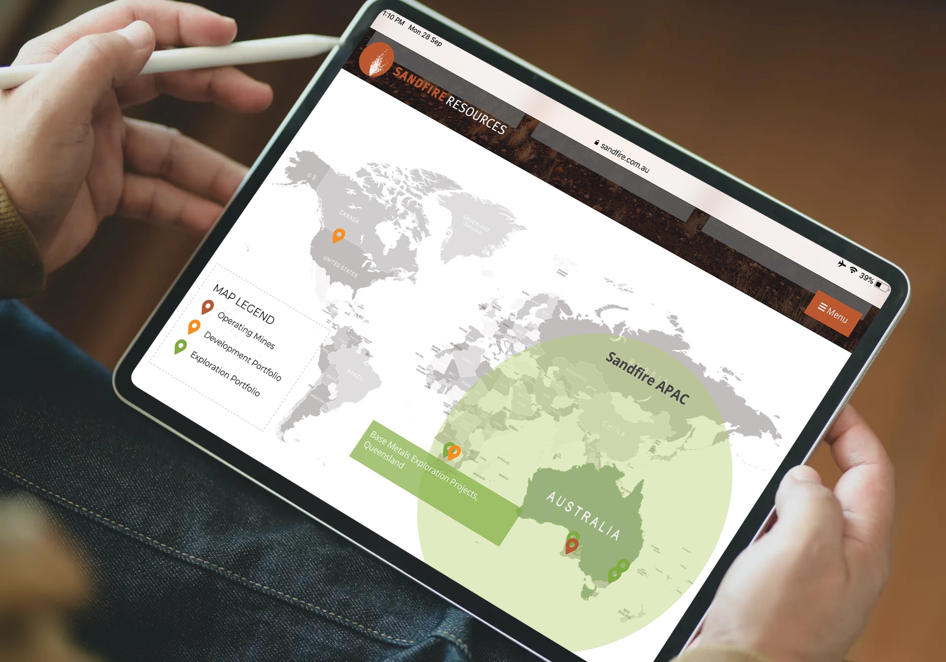
 Sandfire Resources' interactive map flags up operations around the world.
Click on the image above to see how Sandfire Resources does this well with its website's interactive map for worldwide operations. Sandfire (ASX: SFR) is a mid-tier Australian mining and exploration company.
The company’s interactive map helps investors easily find projects in each country. By clicking on pins on the map, users will see more description of each project, such as the status, location and activity of each exploration.
2. Include interactive timelines
Interactive timelines bring life to key milestones and corporate activities that have occurred in your business or project over a period of time. These timelines usually comprise a limited number of words, combined with pictures and/or videos to vividly illustrate your various events.
 Strandline Resources' interactive timeline accentuates its history in a picturesque display.
Tap the image above for a great example of an interactive timeline on Strandline Resources' website. Strandline (ASX: STA) is a mining company focused on mineral exploration and development in Tanzania and Australia.
The company's interactive timeline features vibrant images that relate its history from 2000, including its name change, acquisitions and project developments.
3. Incorporate interactive showcases
Interactive showcases display your company’s products, properties or explorations in a page, with options for users to engage with each feature. From the showcase, users can choose an item or venture and they’ll be directed to a page with more details and images describing it.
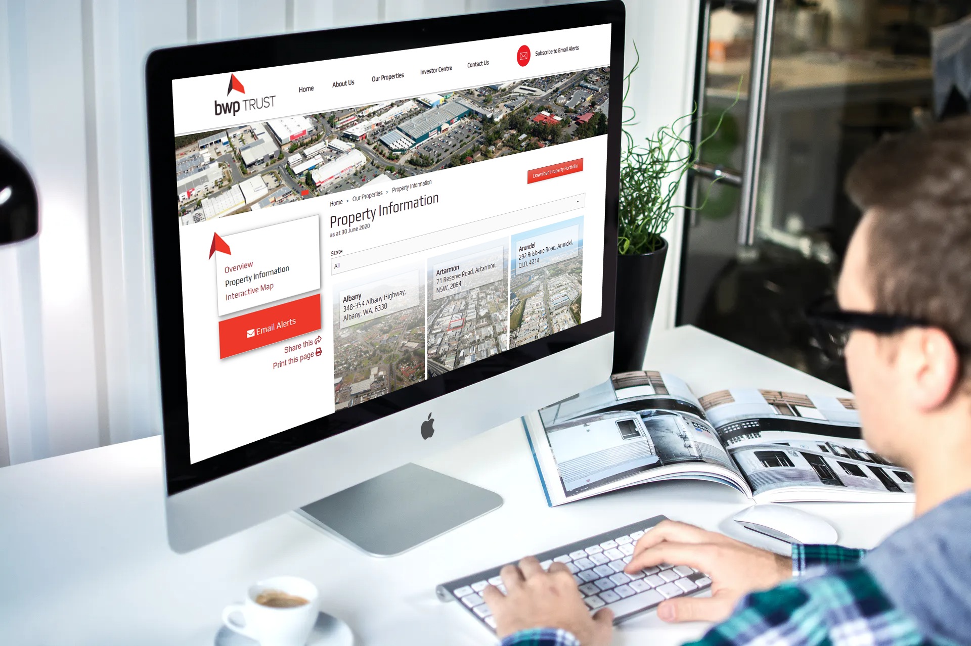
 BWP Trust's interactive showcase displays its wide array of property information.
Select the image above to drop by BWP Trust's website and see an interactive showcase you can take inspiration from. BWP (ASX:BWP) is a real estate investment trust investing in and managing commercial properties throughout Australia.
Through the interactive showcase on its site, users can browse through available properties and simply click on the asset they’re interested in to learn more about it. A filter also allows them to narrow searches per state.
To put it plainly
Adding interactive maps, timelines and showcases are just some ways to enhance interactivity on your website. These tools visually represent a lot of data in an engaging way. Leading to a better experience for your investors, customers and other web users.
A little help on interactivity?
IRM can assist in bringing interactive maps, timelines or showcases onto your website. Feel free to chat us on +61 2 8705 5444 to discuss your needs. Or email us at clientrelations@irmau.com for your enquiries.
Editor's Note: This post was originally published in January 2019 and has been updated for accuracy and comprehensiveness.
