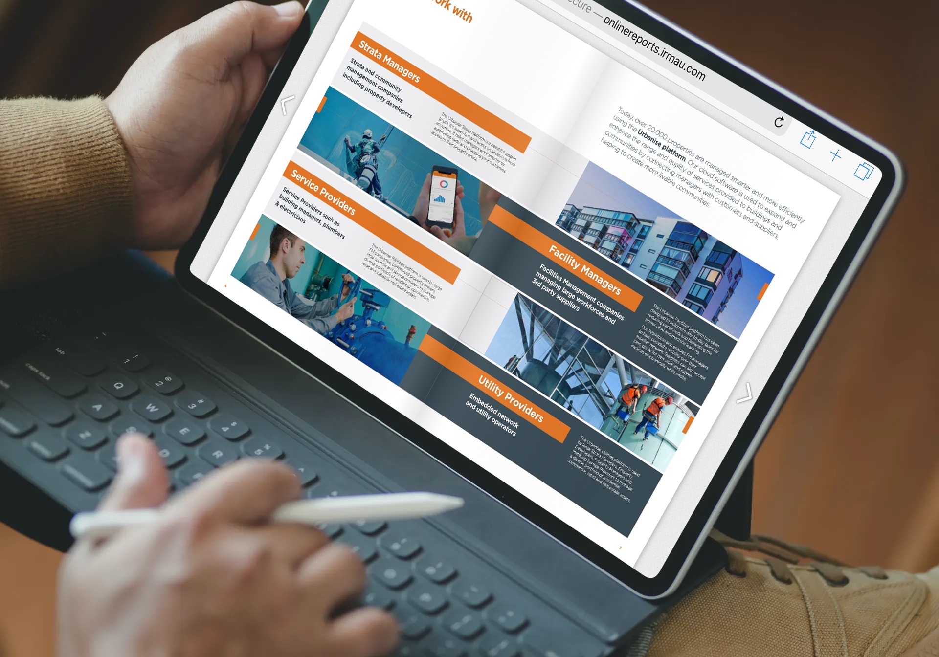
Your annual report is not only an ASX requirement but is actually an online touchpoint touchpoint for your investor communications.
Really? It's a printed document, isn't it? A simple PDF printed document.
You need to think about how it's mainly consumed. Yes, online! The Internet is our preferred medium of communication these days and more and more investors are viewing this document from their mobile devices.
Now, how does your umpteen-page PDF document perform as an online touchpoint? Is the investor proposition something like, "Okay, you download the file, open it in a PDF viewer, and scroll through to the sections you want to read if you can find them"?
Not very investor-friendly, is it?
The same applies to your other reports - sustainability reports, transaction documents, prospectuses, results announcements, etc. If you really do want investors to read them online, they need to be much more user-friendly than the clunky PDF.
Reports are becoming online and interactive, no matter what kind they are. This modern format is what more shareholders expect from listed entities. It brings the company’s results and achievements to life through digital experience investors can engage in!
An online interactive report will not only establish how progressive your organisation is. It will also show stakeholders you care enough to give them a great user experience as they weigh in on investment decisions about your business.
 A reading pane and bookmarking facility help investors locate key info on your online interactive report.
Here are 5 must-have features to keep in mind for awesome online interactive reports investors appreciate:
1. User-friendly page viewer
Your online interactive report should have a page viewer that gives a tactile usability experience, allowing investors to turn pages like leafing through a book. (A flipping sound will make it even more convincing.) Its interactive facilities should include zooming in or having a full-screen mode for a better grasp of facts and figures. Advanced search and text selection tools would be perfect for zeroing in on certain items, like financial summaries or management discussions.
Needless to say, your online interactive report should be mobile-friendly. And that’s not just rendering a desktop layout to fit into a smaller screen size. A mobile-responsive design means shareholders can properly read your report on devices, such as smartphones or tablets.
2. Easy-to-navigate contents
Let’s be realistic. Your report will have a lot of pages. For instance, your annual report will have a detailed description of your business, the directors’ report, the corporate governance report, the financial report, the auditor’s report, among many other key areas.
Wouldn’t it be wise to offer a reading pane then? Where investors can simply choose the contents they want to focus on, add a bookmarking facility, and presto! More ease for them to remember significant pages they can go back to and infer from.
 Your stakeholders would enjoy online interactive reports that are accessible in tablets or smartphones.
3. Downloadable data
You’ve put a lot of work into your report to present all the essential data for stakeholders. Shouldn’t it be easy to download for your growing investor community?
Plus points if your online interactive report could be downloaded as individual pages, sections, or full PDFs. This way, investors can still peruse your data thoroughly when they choose to go offline.
4. Shareable link
A link to your report should facilitate sharing with current or potential investors through your website, email, or social media networks.
Whether its certain sections or the whole digital report, sharing spreads your message with hundreds or thousands of people in an instant. You’ll receive numerous views that will drive traffic to the report and to your website too.
You can even share your online interactive report with the media as a reference. Making it easy for journalists to write about your business with the details found in your digital publication.
5. Data analytics
Google Analytics should be implemented on your online interactive report to track user interactions and gather vital information.
You'll be able to assess your report's content, like which pages are most viewed, and what parts could use improvement. You'll see what page is most often landed on and where users are coming from, among other data analytics.
With this info, you'll be able to modify your report going forward to ensure it speaks to your audience.
At the end of the day
Your investors would love an online interactive report with a user-friendly page viewer, easy-to-navigate content, downloadable data, and shareable links. Don’t forget to make it mobile-responsive so it increases traffic to the report, to your website and provides you the analytics you will need to make an even better report the following year.
It's easier than you think
Your reports can be online and interactive with the right partner – IRM! We’ve got the technical expertise to make your reports shine. Just check out some of our client examples!
Choose an IRM Online Interactive Report (OIR) on a convenient low cost plan to bring the results of your work to life online - on desktop or mobile. If you choose an IRM Annual Report design service, the OIR is included. Otherwise, IRM can turn any PDF into an attractive OIR.
If you're an IRM website client, we'll include the changes to the appropriate web page in the plan cost. If not, we'll help your web developer with some simple instructions to incorporate it.
Get a free quote through this form. You can also enquire through clientrelations@irmau.com or +61 2 8705 5444.
Editor's Note: This post was originally published in July 2019 and has been updated for accuracy and comprehensiveness.
