- Your annual report is more than just a disclosure—it's a reflection of your company.
- Stay abreast of design trends to craft a compelling annual report in 2024.
- Embrace these design styles to engage stakeholders effectively.
Annual reports stand as a testament to ASX-listed companies’ achievements and strategies. Consequently, annual report design continues to evolve in 2024, blending creativity with functionality to engage stakeholders effectively.
Incorporating current design trends into your annual report not only enhances visual appeal. It also strengthens your company's brand identity, fosters investor engagement, and reinforces trust in your corporate governance practices.
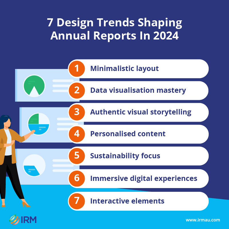
Seize the opportunity to redefine your annual report design and communicate your stories with clarity and impact. Check out some design trends shaping annual reports this year to guide your business towards a visually captivating disclosure.
1. Minimalistic layout
Minimalist layouts are becoming increasingly popular as companies aim for clean design, ample white space, and crisp typography in annual reports. Consider featuring a tidy grid layout with clear headings and concise text in your annual report to allow investors to navigate your information effortlessly. Your annual report cover could also go with a simple, striking image and minimal text to convey your corporate narrative in a visibly impactful manner.
2. Data visualisation mastery
With data-driven decision-making at the forefront, mastering data visualisation techniques is essential for providing complex information effectively. Employing charts and graphs in your annual report enables your stakeholders to easily get facts and relevant insights. Additionally, you could use infographics to summarise key data points and trends, making information more accessible and engaging for your investors.
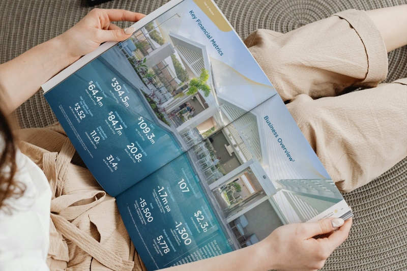 Use a minimalist layout in your annual report.
3. Authentic visual storytelling
Authenticity remains paramount in annual report design, with emphasis on genuine imagery, candid photography, and real-life testimonials. For instance, using documentary-style images to capture your company's values and influence on communities creates a powerful story that resonates with stakeholders. Highlighting employee portraits and quotes in your annual report showcases the diverse voices and experiences within your business too.
4. Personalised content
Annual reports are embracing personalisation through targeted messaging, custom illustrations, and bespoke storytelling. You could incorporate personalised messages from your top executives or board members to add a human touch to your report and strengthen relationships with investors. If you’re a healthcare company, you might want to include case studies underscoring patient success stories relevant to several stakeholder groups.
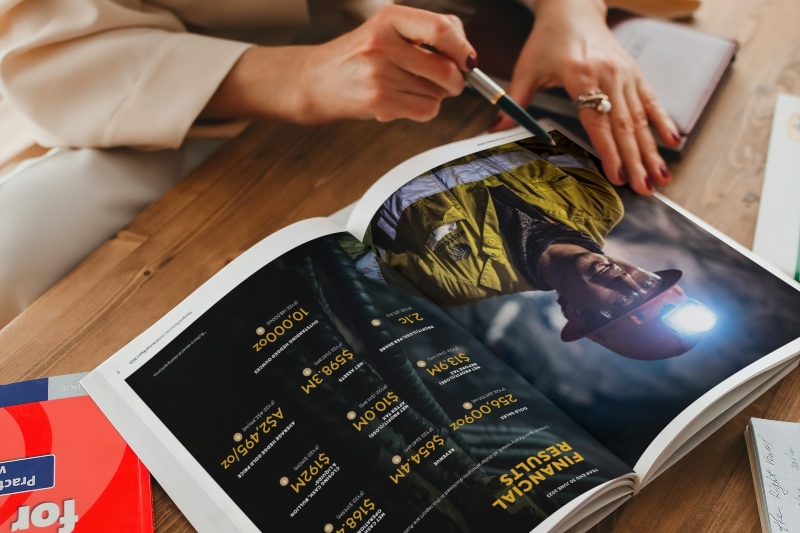 Apply authentic visuals in your annual report.
5. Sustainability focus
Reflecting growing environmental and social consciousness, annual reports are incorporating sustainable design elements, such as eco-friendly materials, renewable energy imagery, and carbon-neutral printing. You could have your annual report printed on recycled paper with illustrations showcasing your company's commitment to renewable energy sources. Plus, you could opt for online annual reports to reduce paper consumption and carbon footprint, aligning with your organisation’s sustainability goals.
6. Immersive digital experiences
Yes, annual reports are transcending traditional formats to offer immersive online experiences. Your printed annual report could have an online version allowing investors to turn pages like leafing through a book. This format usually comes with a user-friendly page viewer, easy-to-navigate content, downloadable data, and shareable links. Or you could have your report designed as a microsite, featuring interactive elements and multimedia content that’s accessible across various devices for a seamless user experience.
7. Interactive elements
Should you go with a microsite, interactive elements, such as clickable graphics, embedded videos, and animated infographics are gaining prominence in annual reports. You might include a clickable map of your explorations or global presence, allowing stakeholders to explore your different regions and key operations. Perhaps you could have a dynamic chart that allows investors to adjust parameters and picture a range of financial scenarios.
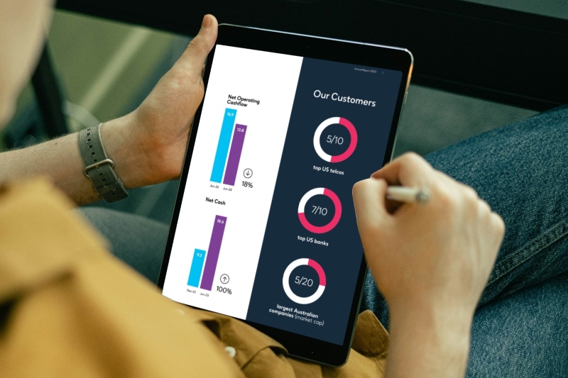 Add interactive elements for your online annual report.
Make your annual report count
Staying abreast of design trends is imperative to crafting compelling annual reports as your ASX-listed company navigates the evolving landscape of corporate reporting. Embracing these design styles can elevate your communications and engage stakeholders effectively.
Remember, your annual report is more than just a disclosure—it's a reflection of your company's achievements and aspirations. Let's make it count in 2024 and beyond.
Go for a stress-free annual report design
Why be stressed out when you can have IR design pros to get things done? Your annual report will be styled to impress investors as it gets your message across – in print or online.
Get a quote here today! Better yet, contact us on +61 2 8705 5444 or clientrelations@irmau.com to kickstart the project.
Related blog posts:
How your Annual Report gains advantage with IR design experts
Annual Report: What investors want to see beyond the numbers
How to make your Annual Report stand out
